Interfaith Center for Sustainable Development
Hopeful and human-centric – branding for an ecological organisation mobilising faith groups towards a sustainable future.
Client: Interfaith Center for Sustainable Development
Commissioning Agency: Greenhouse Communications
Project Type: Branding; logo design; layout, design for print and social media promotion
-
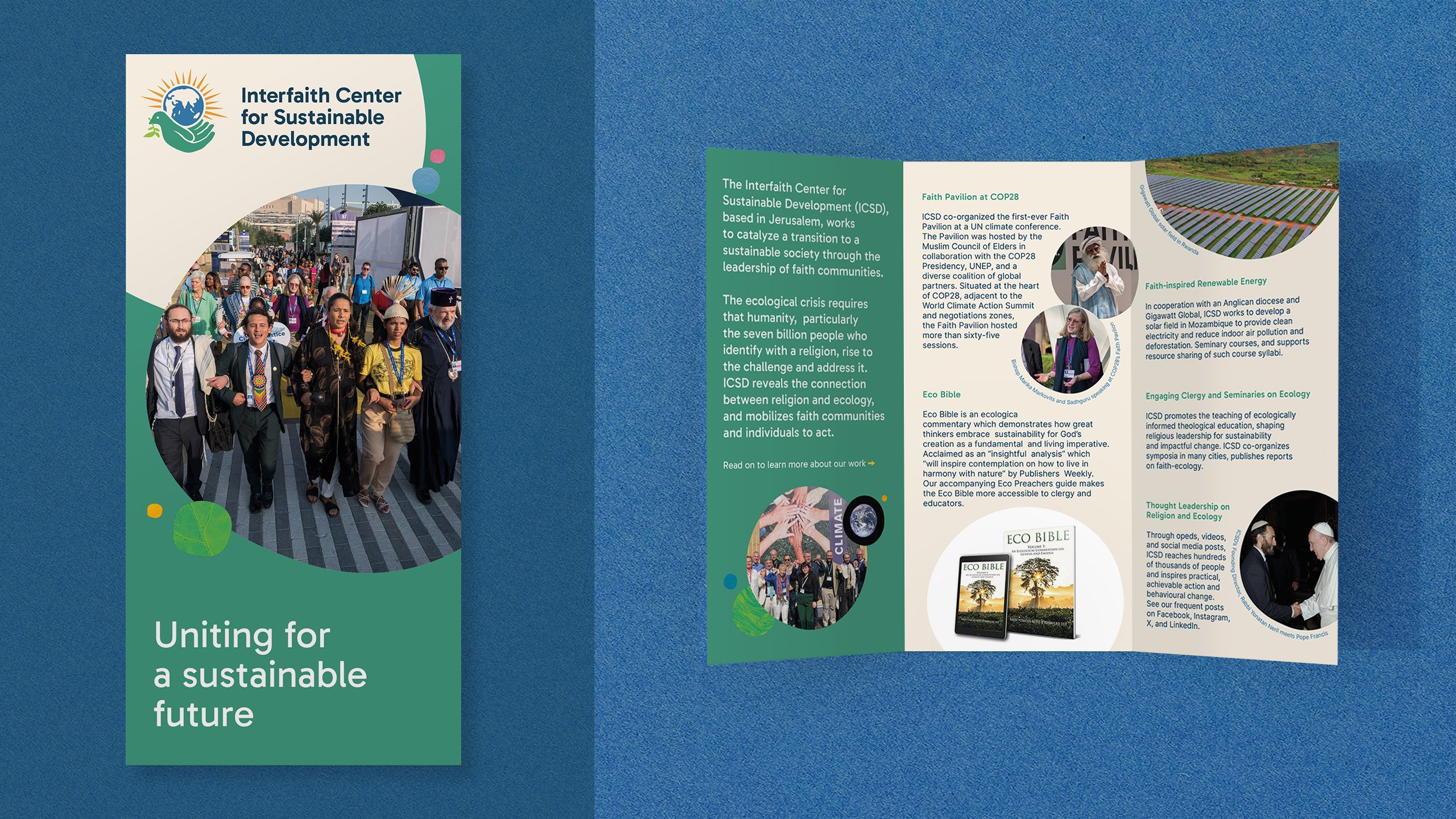
Following on from work for COP28’s Faith Pavilion, we were asked to rebrand one of its stakeholder organisations, the Interfaith Center for Sustainable Development. Their aim is to bring religion to bear on the climate crisis and wanted to use the momentum gathered during COP to boost fundraising efforts for their work. As such they wished to more closely align themselves with the Pavilion’s visual identity.
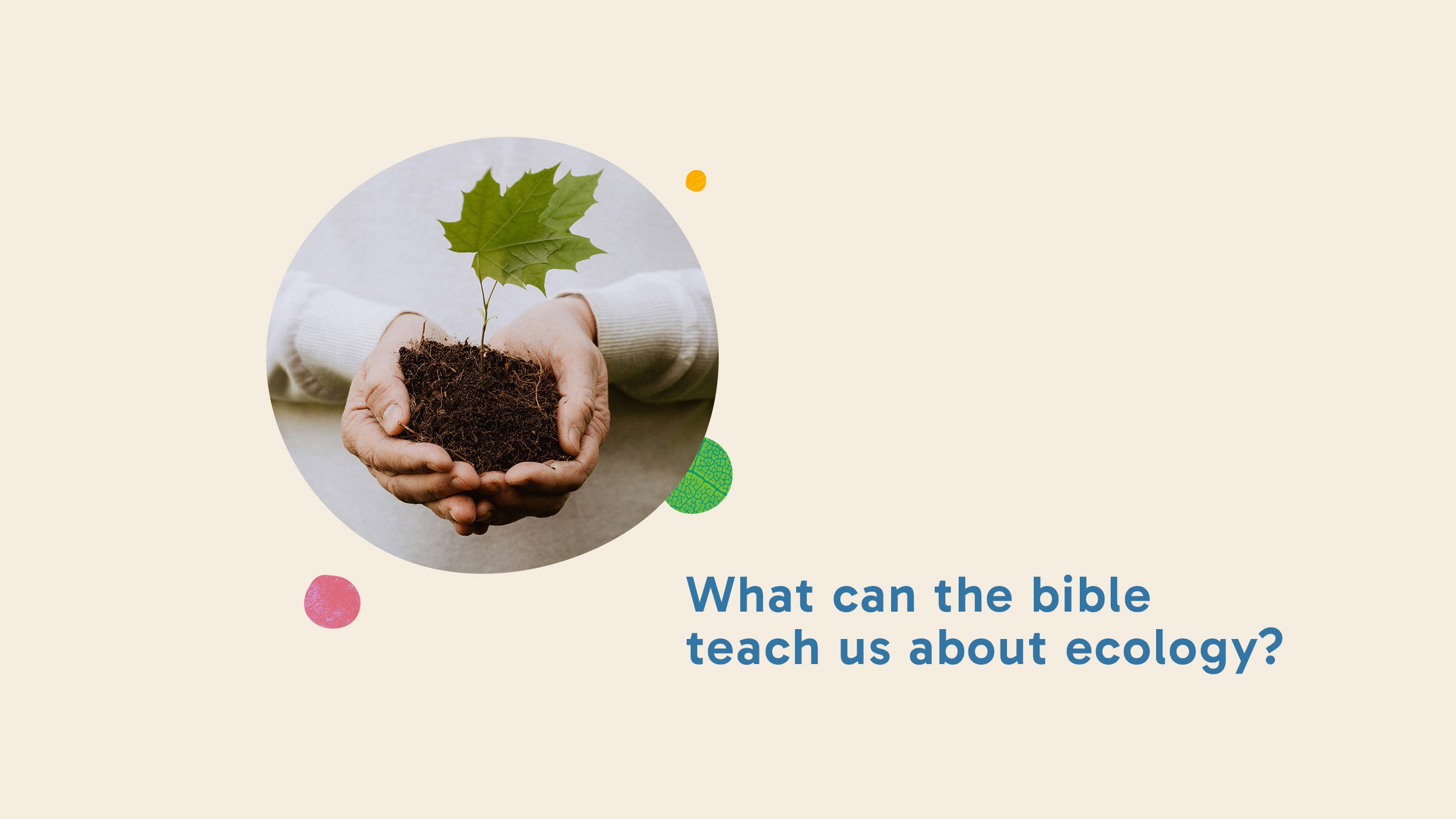
We started the project by conducting a competitor analysis, looking at the visual identities of other comparable organisations to identify key themes. We found that the majority are very serious in tone, or in an attempt to appear trustworthy and professional end up presenting as overly corporate. Neither were desirable for ICSD. They wanted to adopt a more hopeful, accessible and overall more positive tone of voice with the aim of growing their audience.
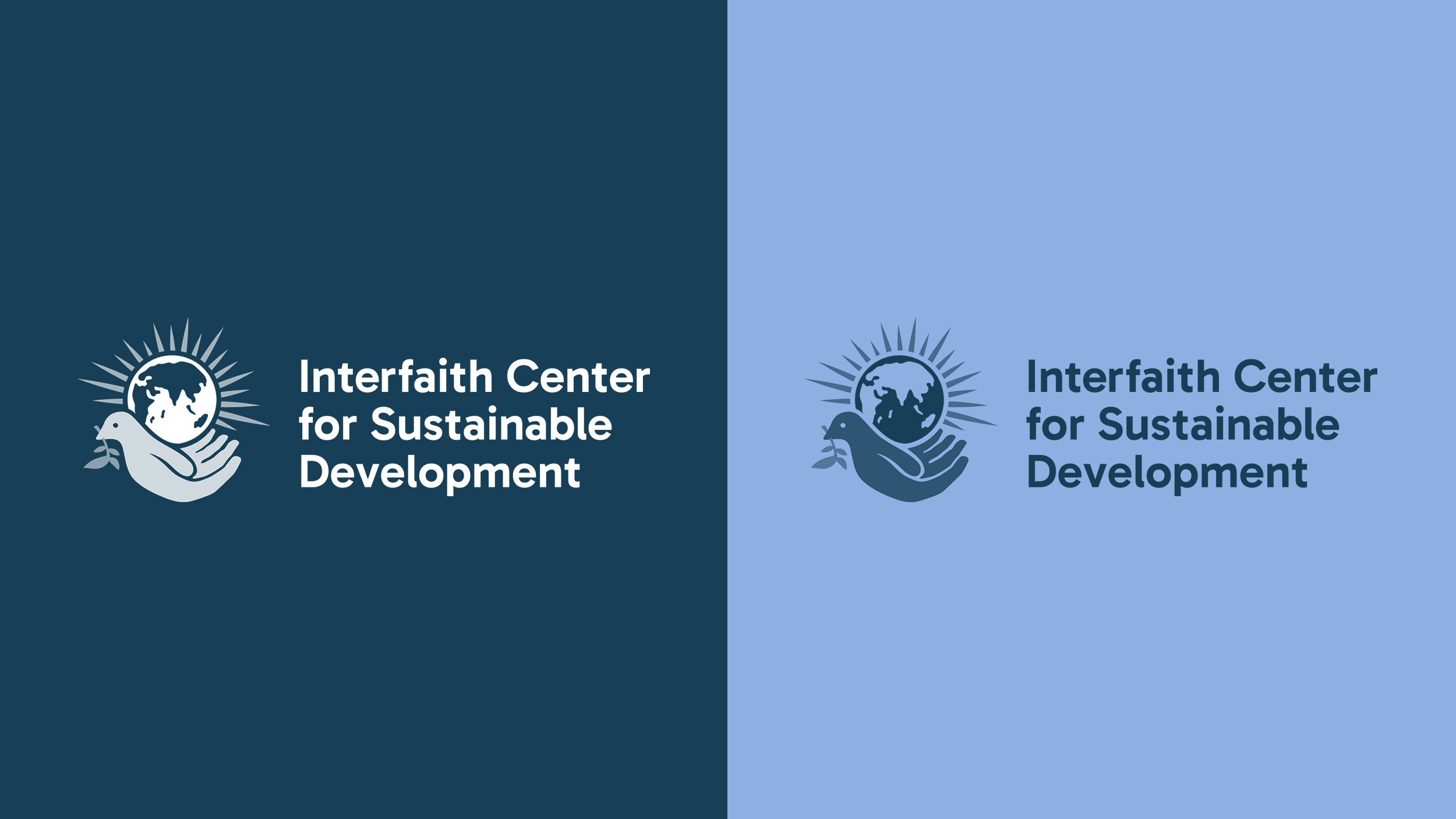
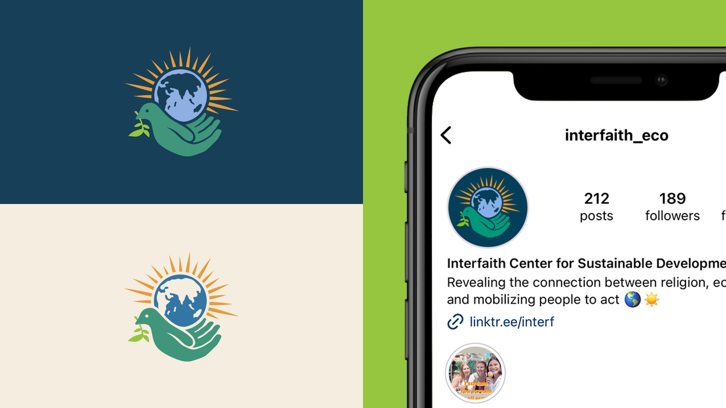
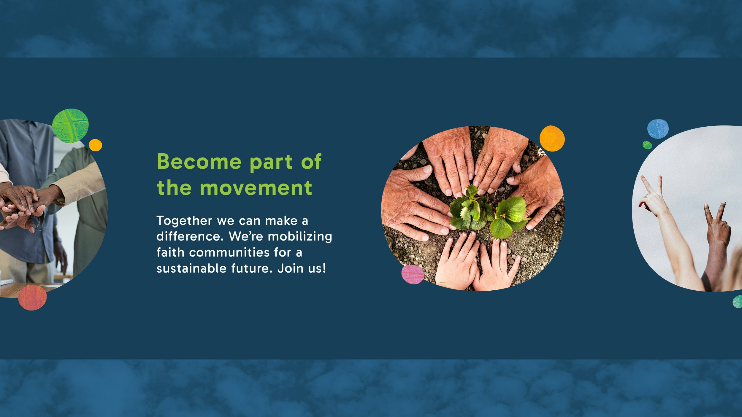
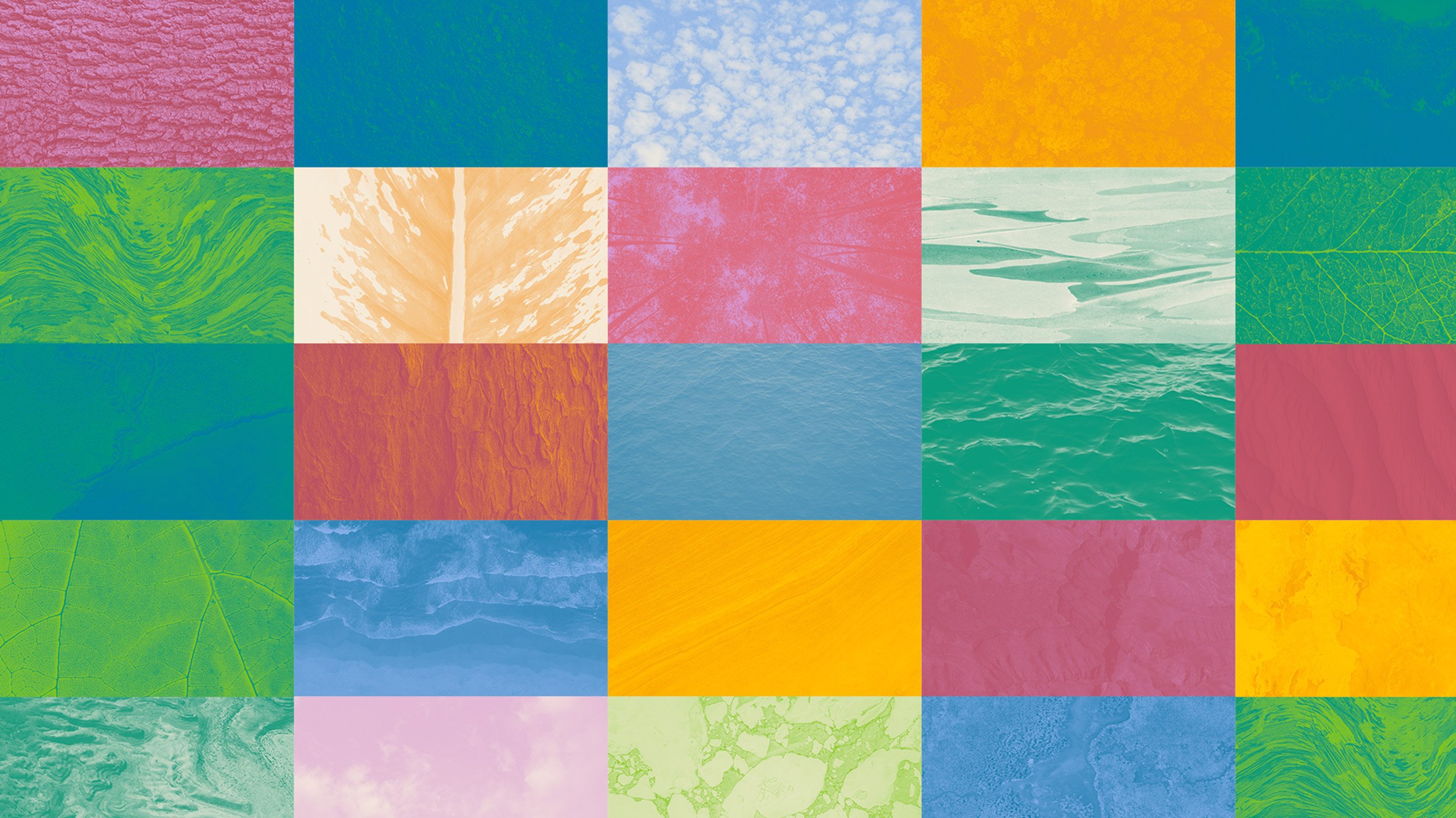
As such, the ecological theme of the Pavilion was carried through and adapted for ICSD. Though still nature-themed, a more playful colour palette was introduced and the nature texture backgrounds were expanded, providing a library of easy to implement – and visually pleasing – assets for ICSD to use. Another departure was moving away from the square tile design of the Pavilion. Instead we adopted an irregular circle as a graphic device, used as a container for photography, the nature textures and as a background element for text.
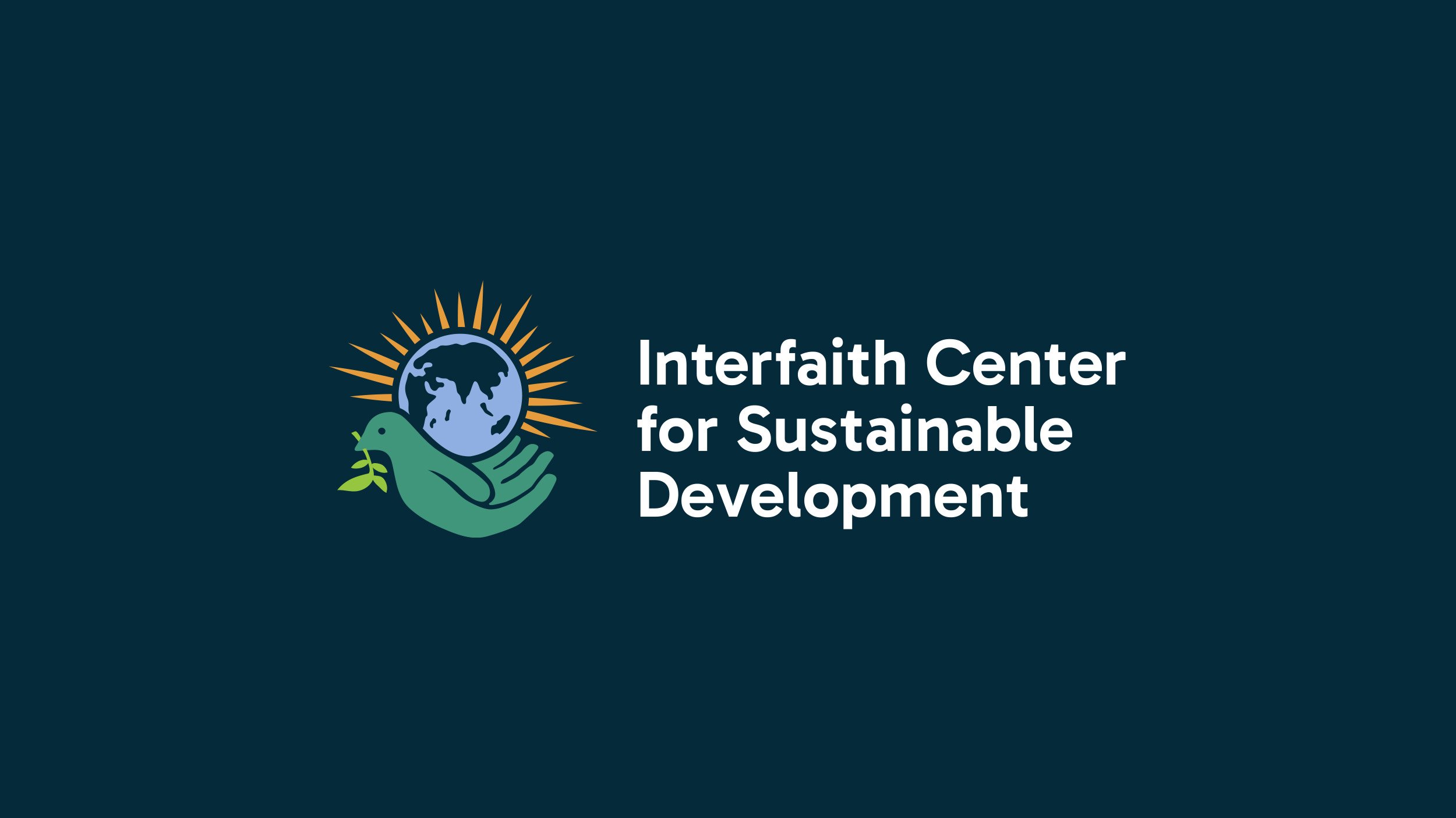
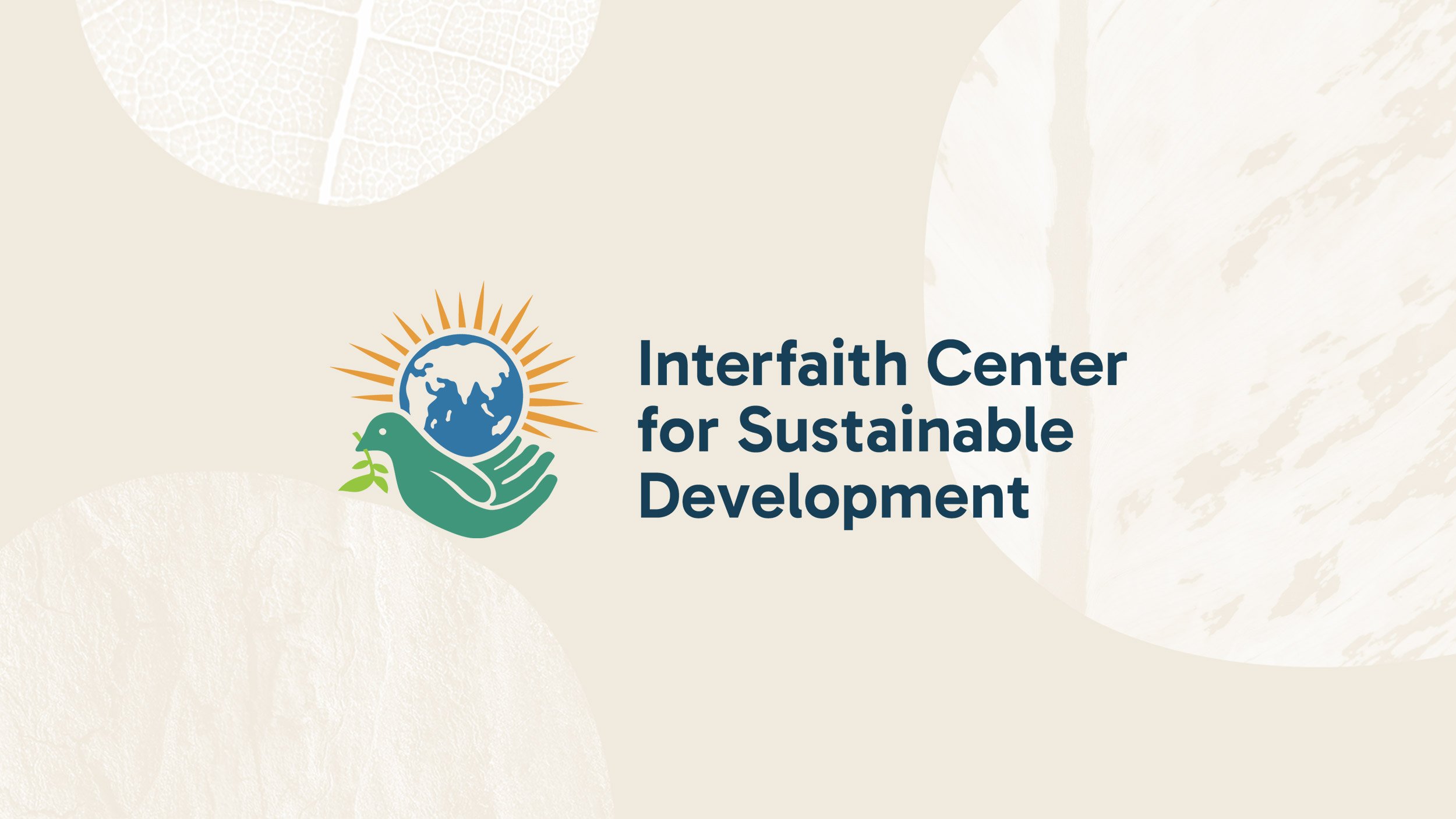
Circles feature in the logo also, where the globe features as a central element; ICSD's efforts are global but also its activities focus on nature and global ecology. Radiating from the earth are rays of light, connoting energy and holy light and below is a compound illustration of a dove in flight and a hand cradling the earth. The peace dove features in many religions and is synonymous with harmony and collaboration where as the hand indicates how we all have a part to play in caring for the earth – we are all its custodians.
The logo emphasises humanity – not just in the imagery used but the style, which has a hand-drawn quality implying a sense of "for people, made by people”, communicating that ICSD is not intended to be highly polished and 'corporate' in feel – but accessible and communicative to all.