Attainable
A new brand name and a versatile, scalable visual identity for an organisation who supply activists with campaign support and funding – providing them with building blocks for the future.
Client: Attainable
Project Type: Naming; branding; logo design; art direction for print and digital promotion
-
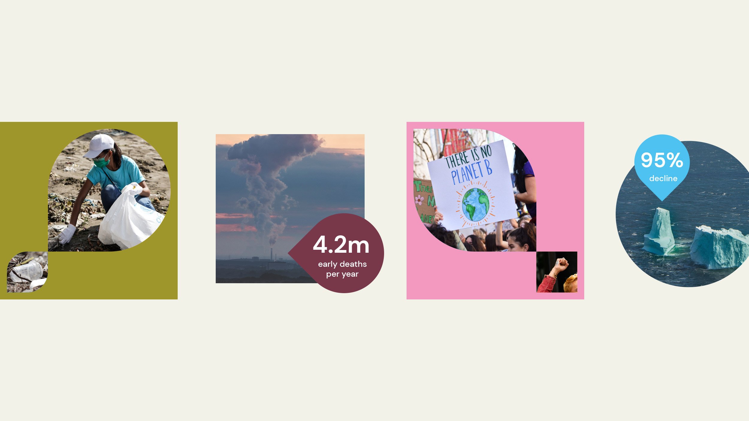
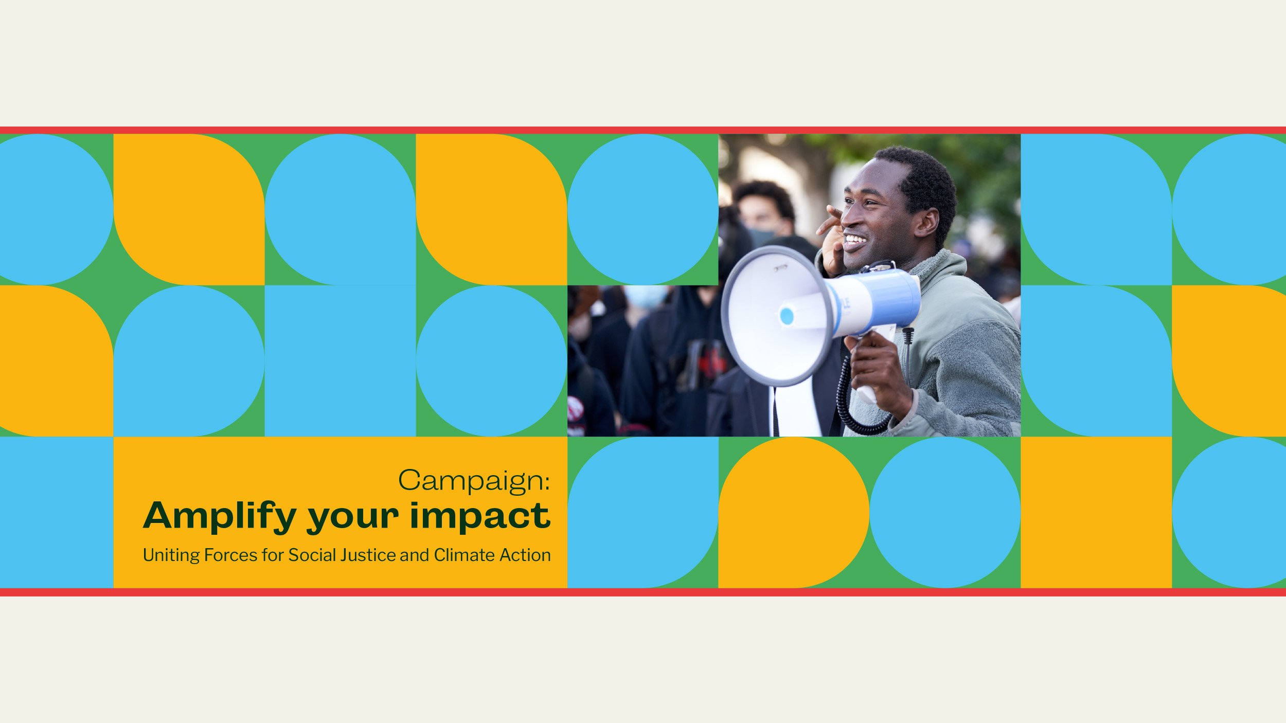
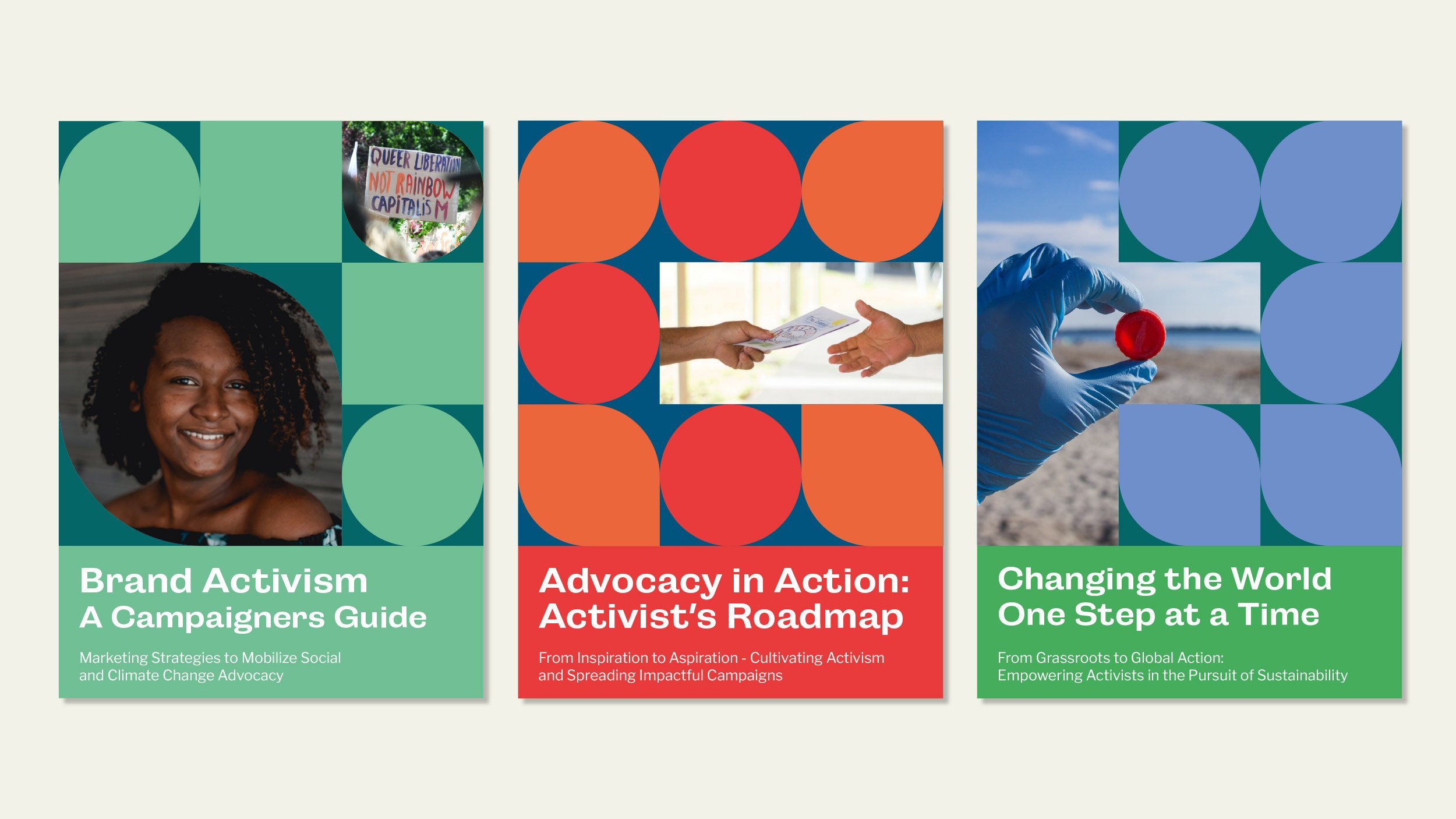
Attainable is a non-profit organisation that launched in 2021 supporting activists running campaigns for a variety of causes – from social injustice to climate change. Their goal is to remove the systemic barriers to funding that many activists face, by making the process of applying for and receiving grants and campaign support, quicker and easier.
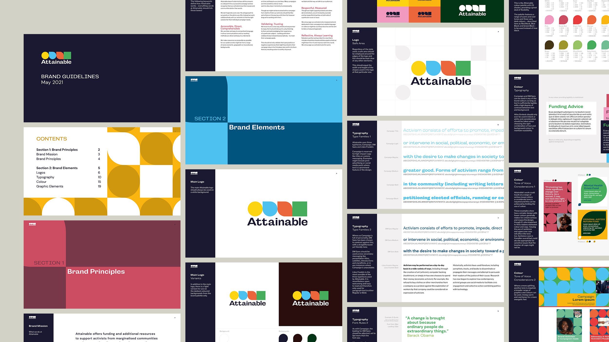
We branded the organisation, a process that included a naming workshop, creation of its visual identity, a full set of brand guidelines as well as some preliminary designs for social media templates and website.
The name Attainable was chosen as it conveys a sense of optimism, agency and honesty – that no campaign is successful by default and its aims and objectives are often hard-won. For many activists, the view prevails that applying for funding is pointless, that due to the perceived or presumed systemic barriers in place, being awarded funds remains a mere a possibility. Attainable want to change that – proving that an activist applying for, and being awarded campaign funding is not just a possibility but an attainable reality.
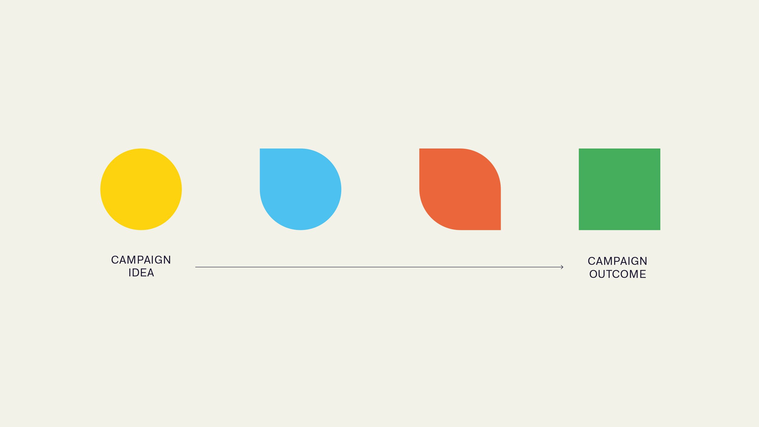
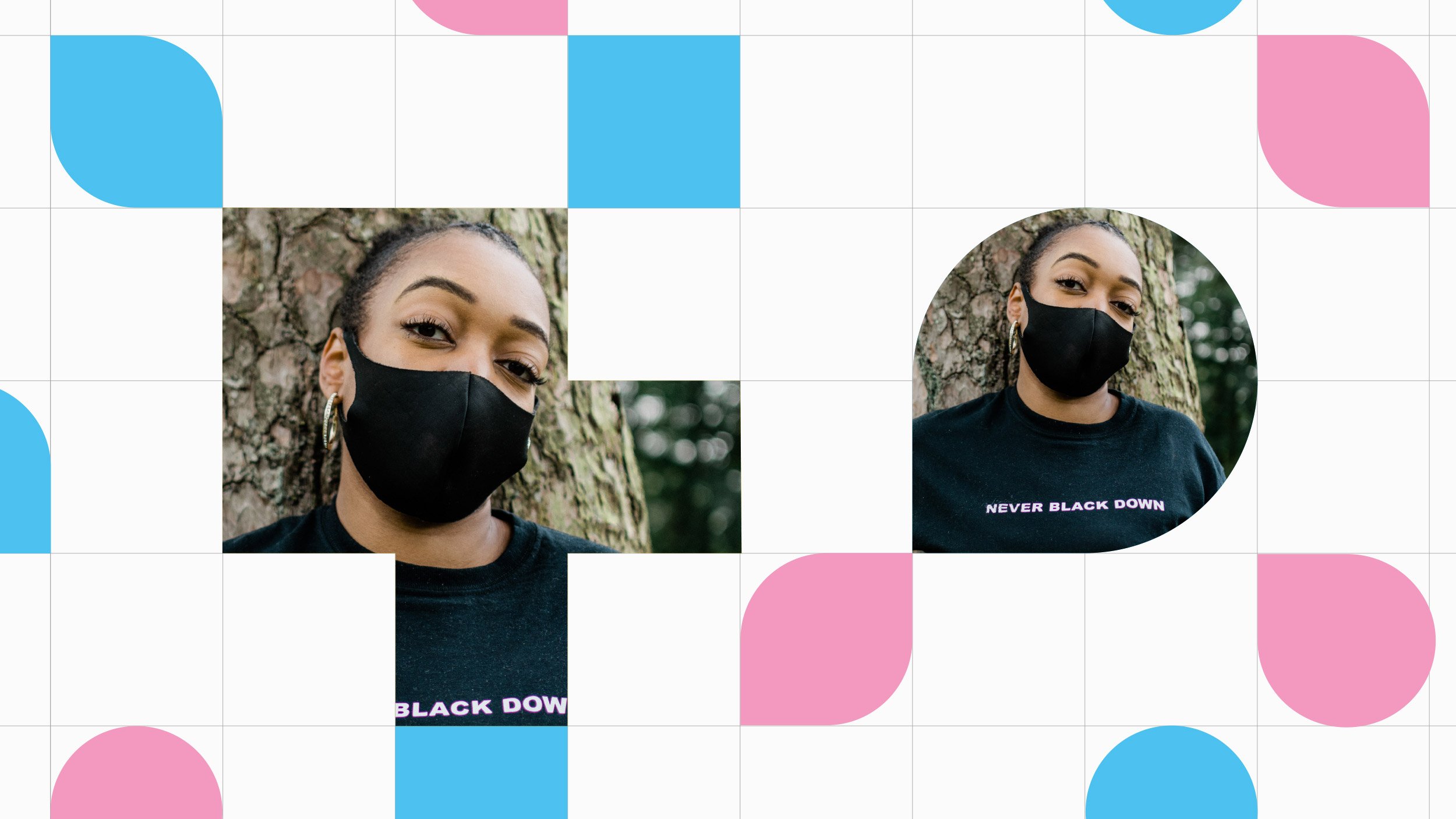
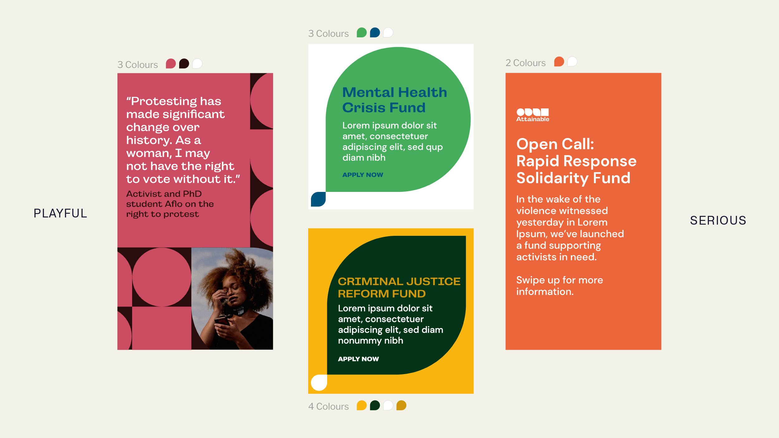
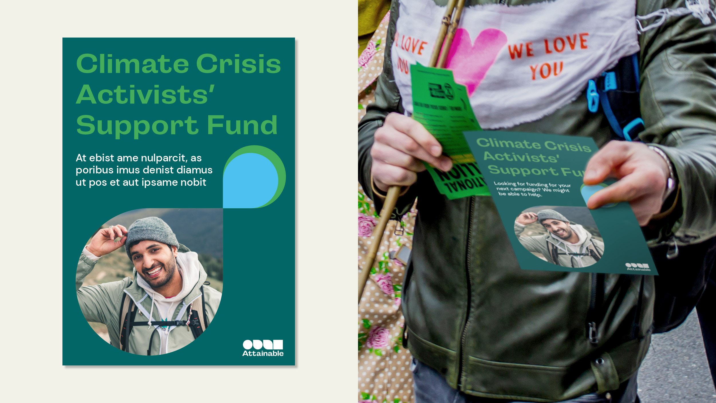
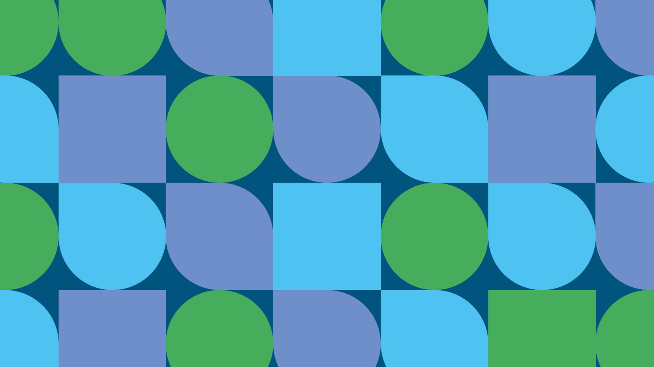
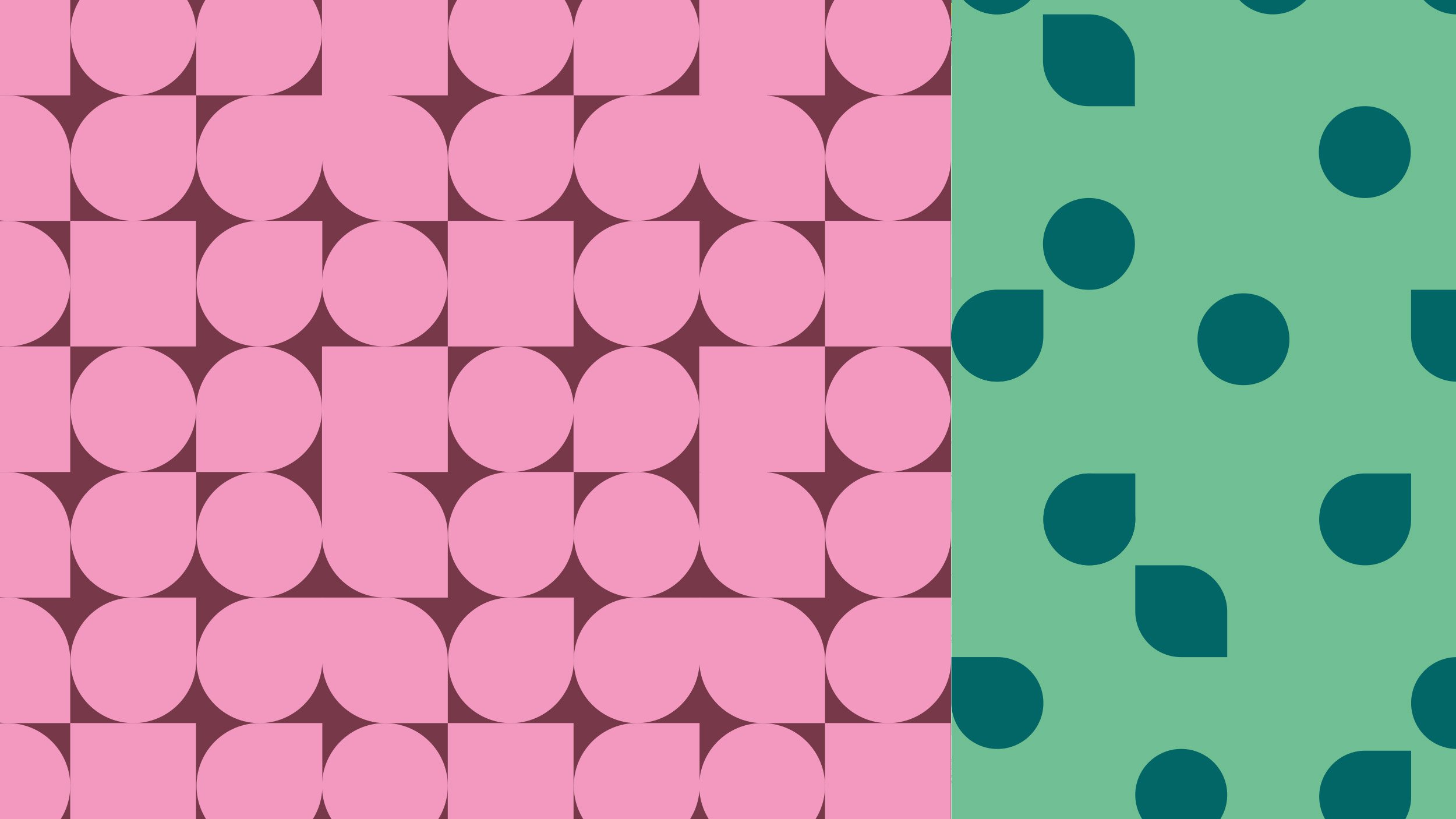
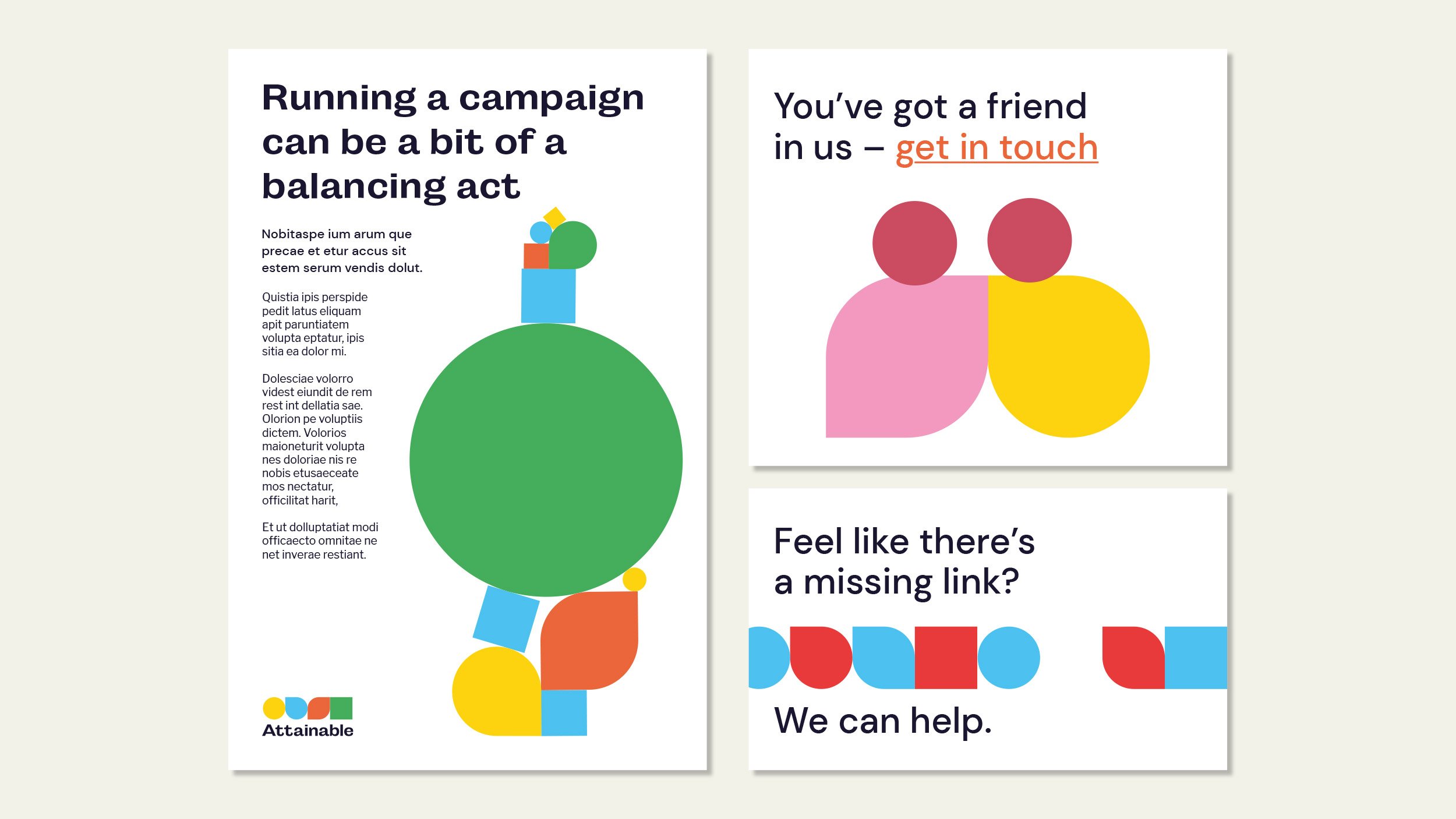
During the development of the visual identity, a key consideration for the client was that Attainable should offer activists ‘building blocks for the future’ and this eventually became the main component of the chosen design route. A set of shapes were used to communicate how an idea can become reality over time, where a circle, representing the non-fixed, initial campaign idea, morphs into the more secure and stable square, representing the end result.
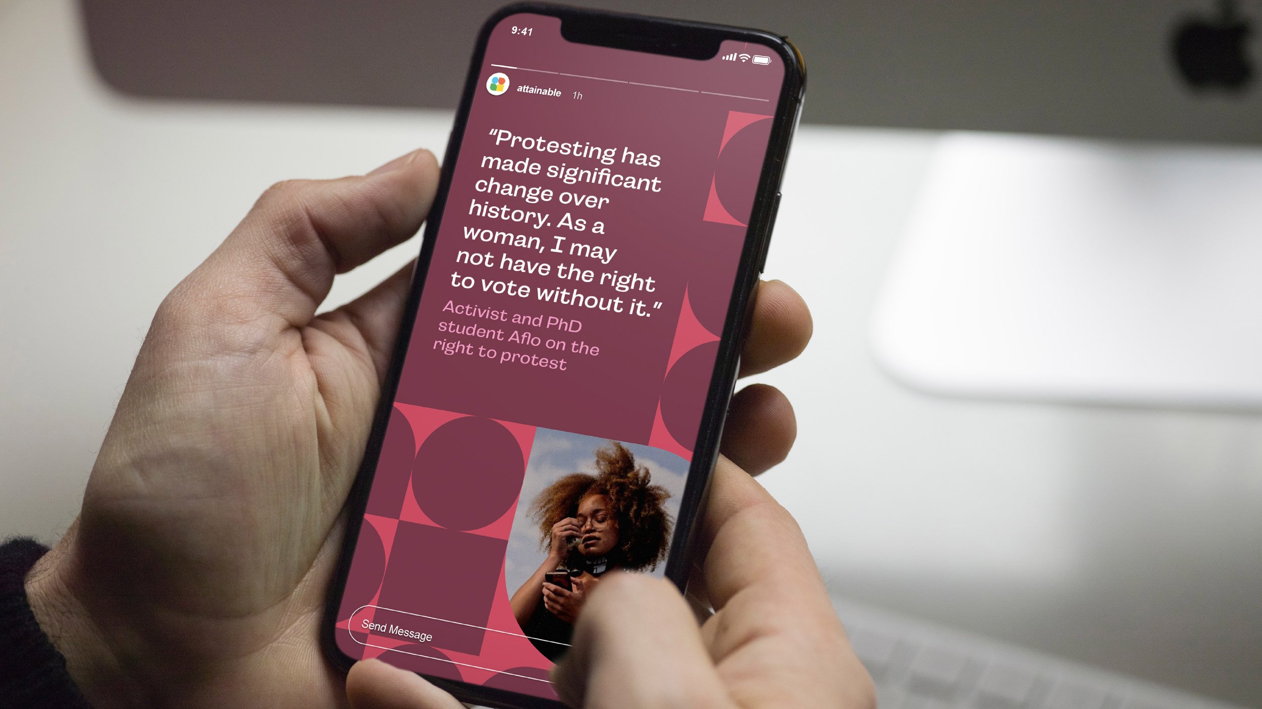
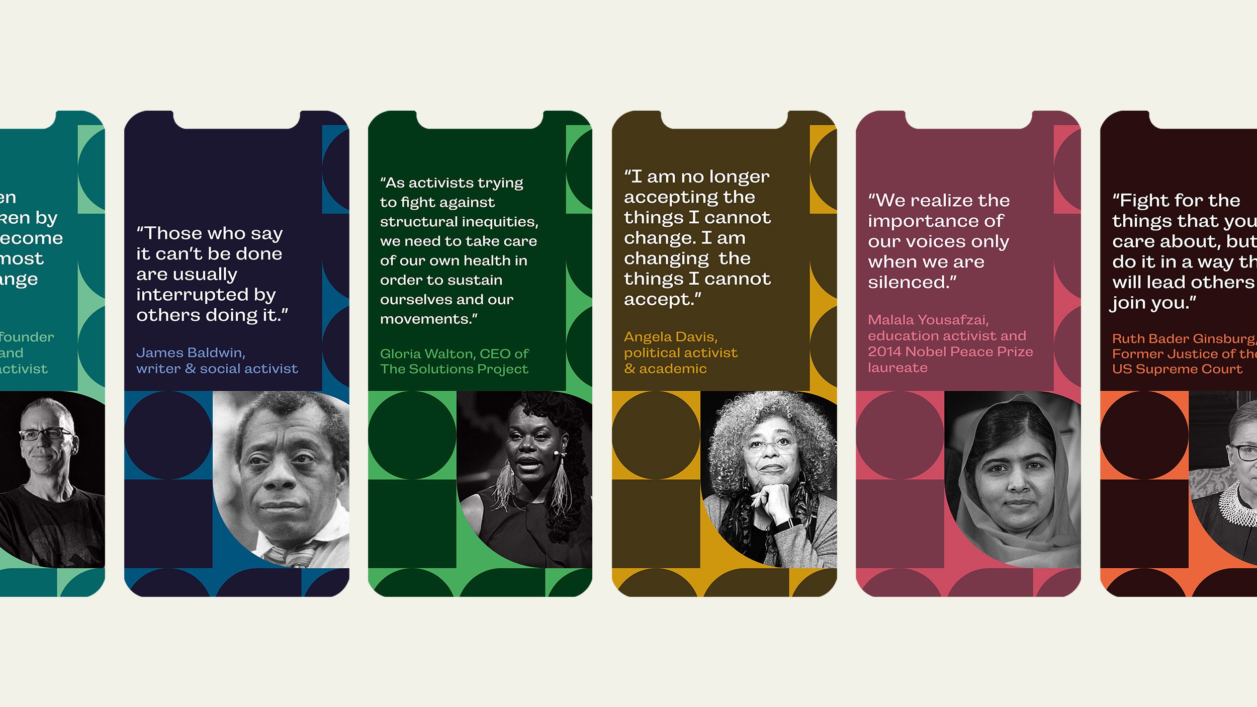
The identity is designed to be as versatile as possible as it has to adapt to multiple scenarios and communicate with different stakeholders. Specific rules were developed for how colour, type and composition can work together; it was important that the brand is able to ‘speak’ in different tones of voice, which might change depending on the issue, topic or theme they are offering support for. The shapes forming the Attainable logo also act as vessels for text and image across multiple aspects of the identity, also acting as an illustrative device if photography isn’t appropriate to the theme or is otherwise unavailable.