COP28 Faith Pavilion
Working with an international group of stakeholders to produce the identity for COP’s first ever Faith Pavilion.
Client: COP28 Faith Pavilion
Commissioning Agency: Greenhouse Communications
Project Type: Branding; logo design; art direction; design for print and social media promotion
With thanks to Interfaith Center for Sustainable Development, CAFOD, Muslim Council of Elders and The Lutheran World Federation for some photography used
-
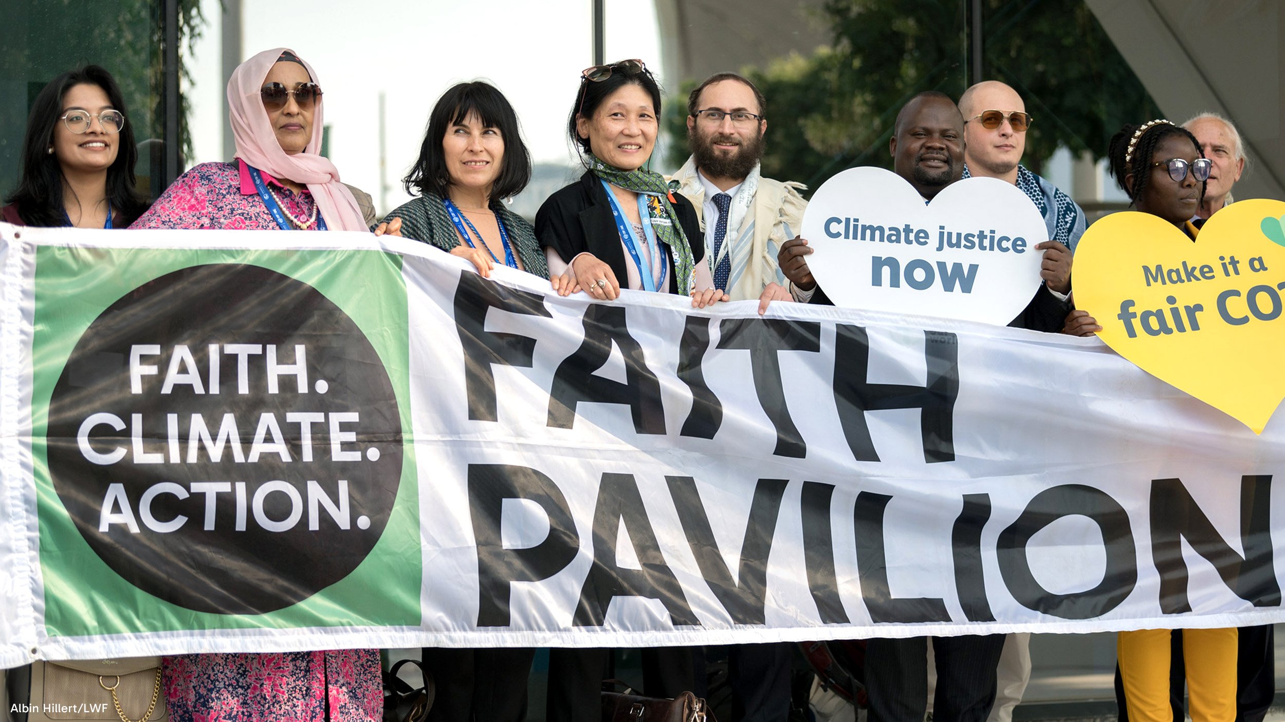
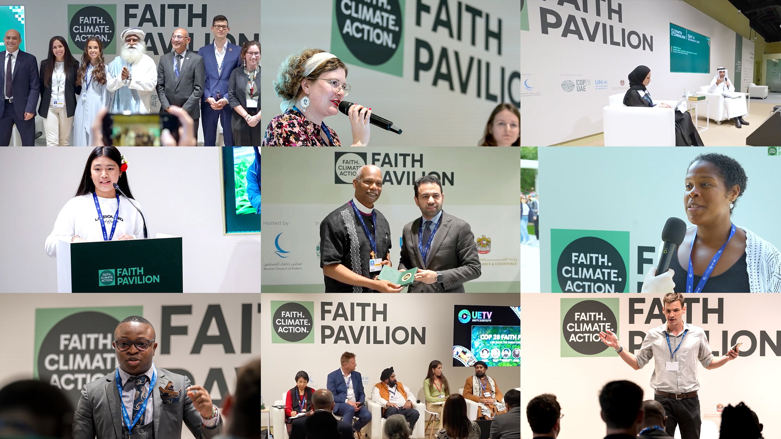
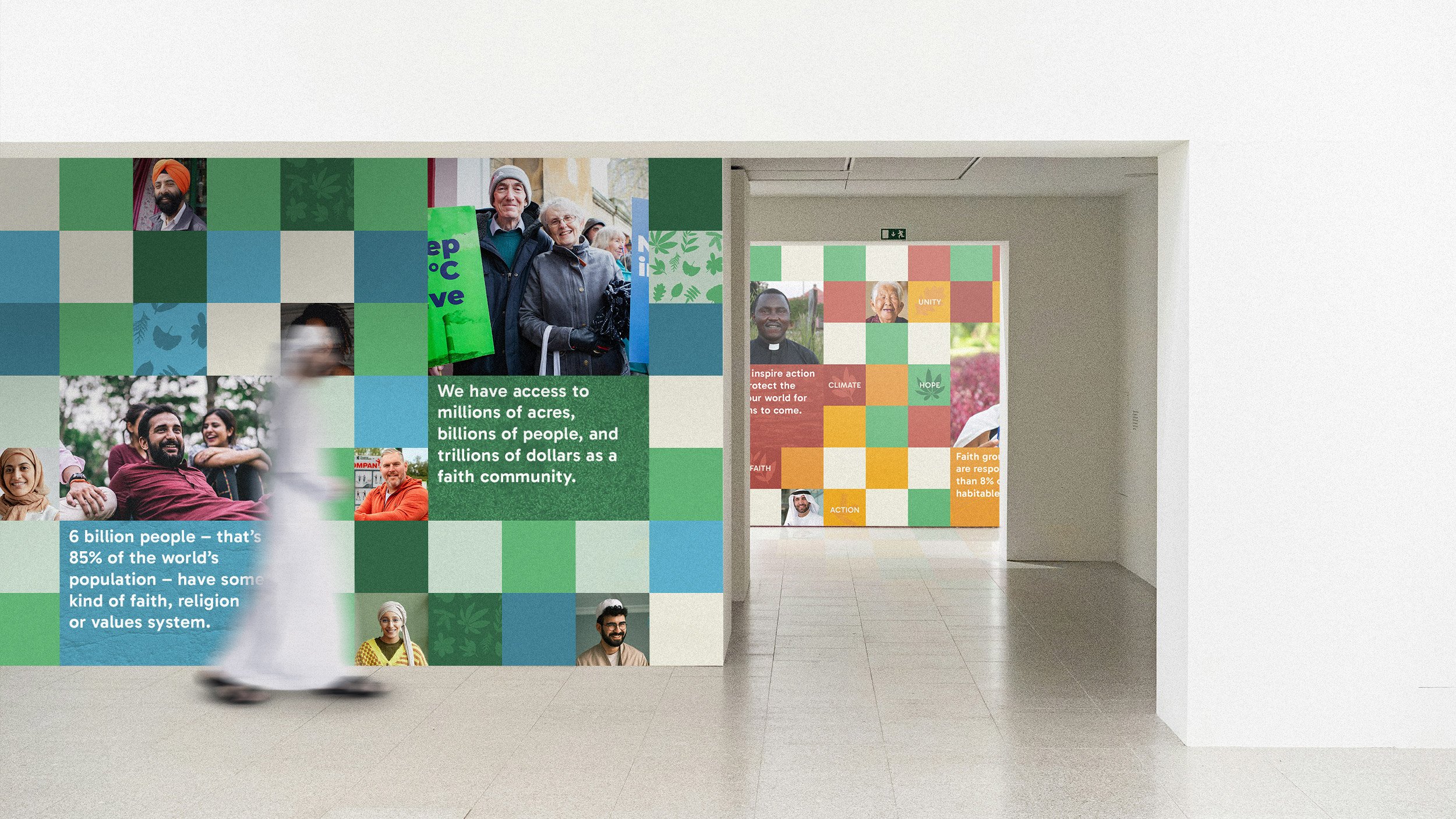
In 2023 COP28 hosted its first ever Faith Pavilion, bringing together 325 speakers from 54 countries to explore faith, science, climate and humanitarianism. Together they called for urgent action from governments, set out inspiring solutions and demonstrated how faith communities can be pivotal to tackling the climate crisis. Globally 6 billion people have faith of some description – around 85% of the population – so there is huge potential for change when this is channelled into collective effort.
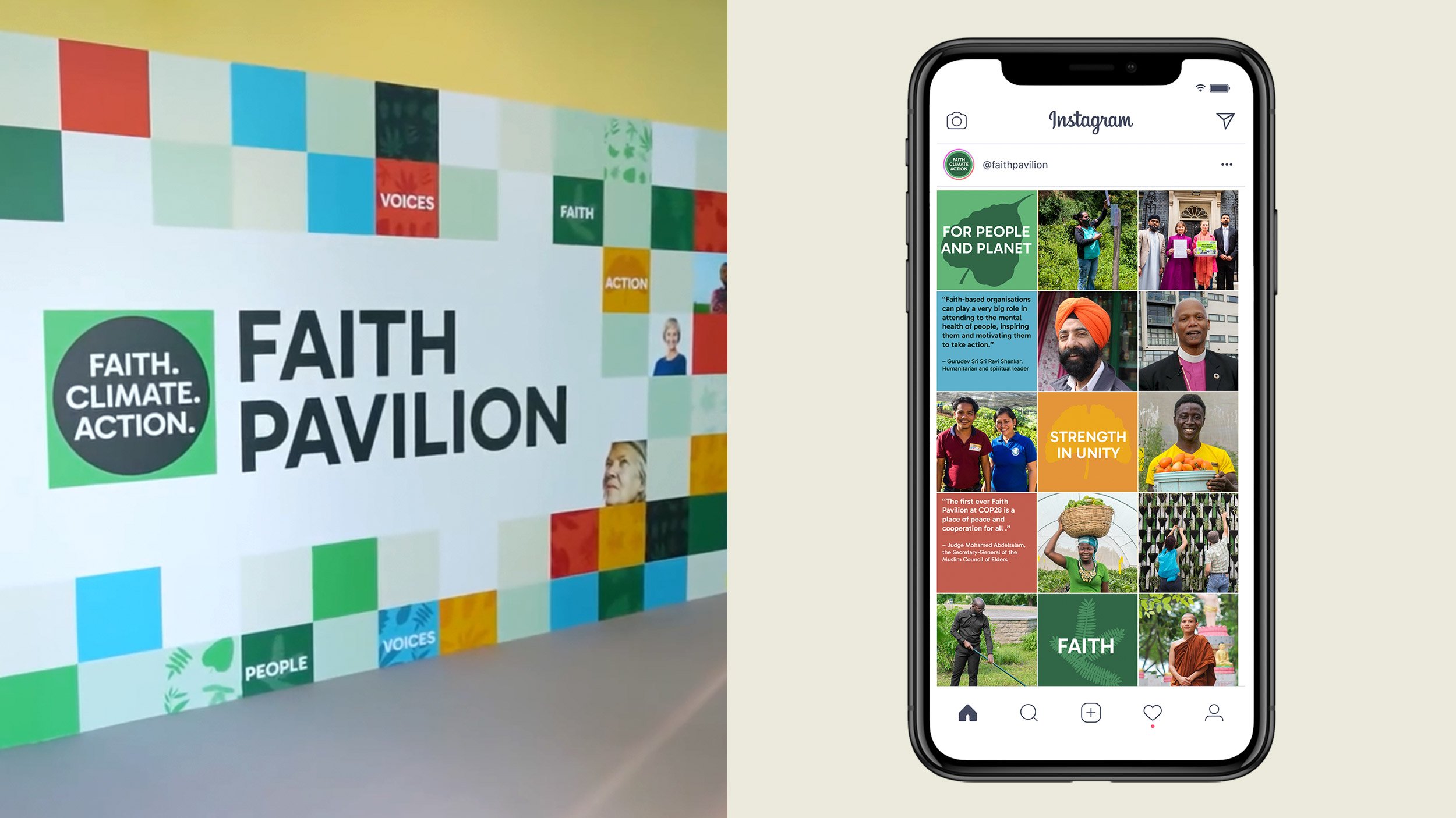
The Pavilion’s organisational committee was made up of stakeholders from multiple prominent faith groups and we worked with them, led by Greenhouse Communication’s strategic vision, to create an adaptive identity for use at the pavilion site and online, where it was promoted through social channels and across various stakeholder websites.
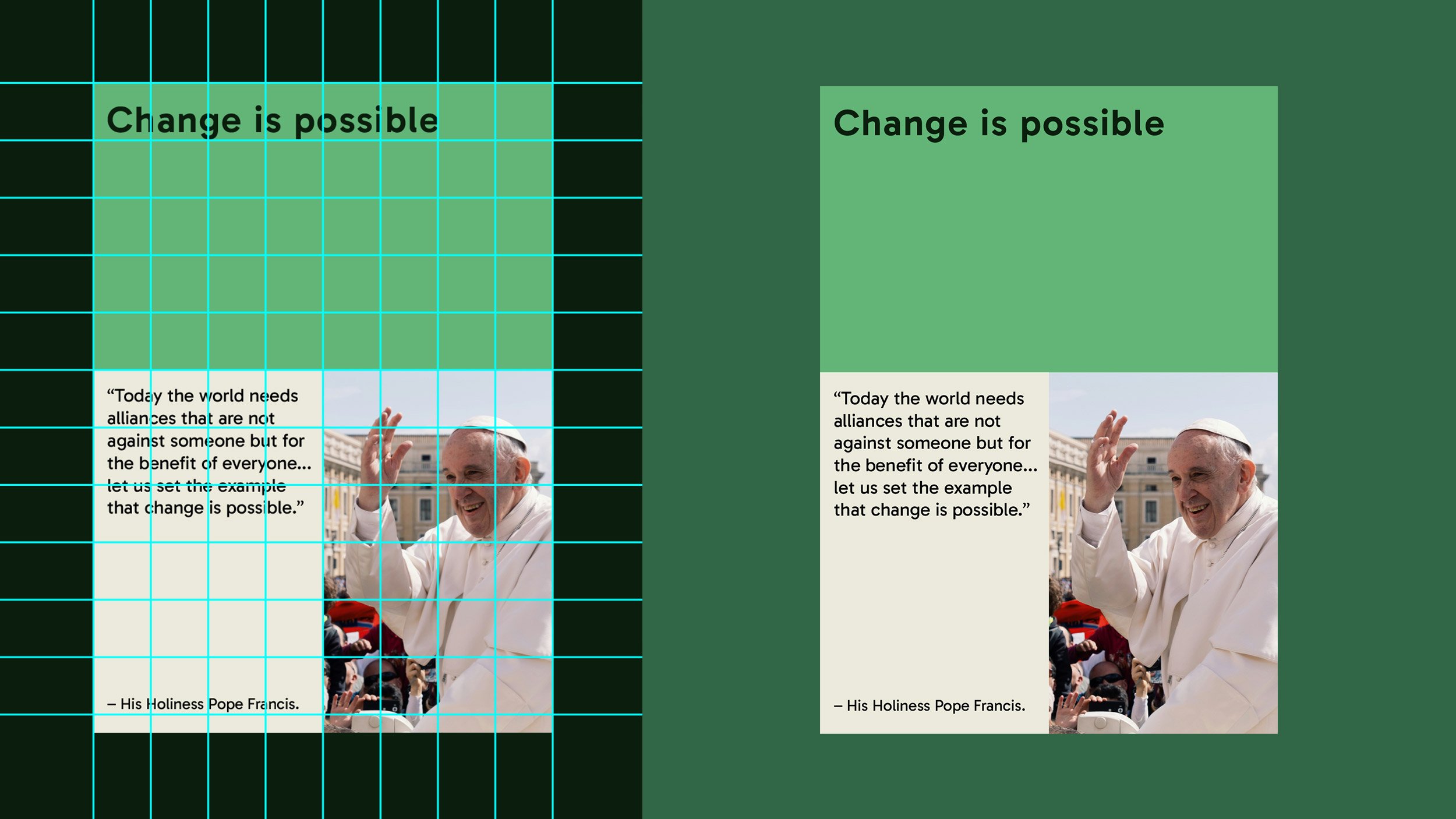
As the identity was representative of many different faith groups, depicting any overt religious symbolism or motifs wasn’t an option. Though this might’ve been communicative of the main faith traditions, many others, including those from some indigenous cultures, don’t use such clearly defined symbolism and so we looked to the natural world for inspiration.
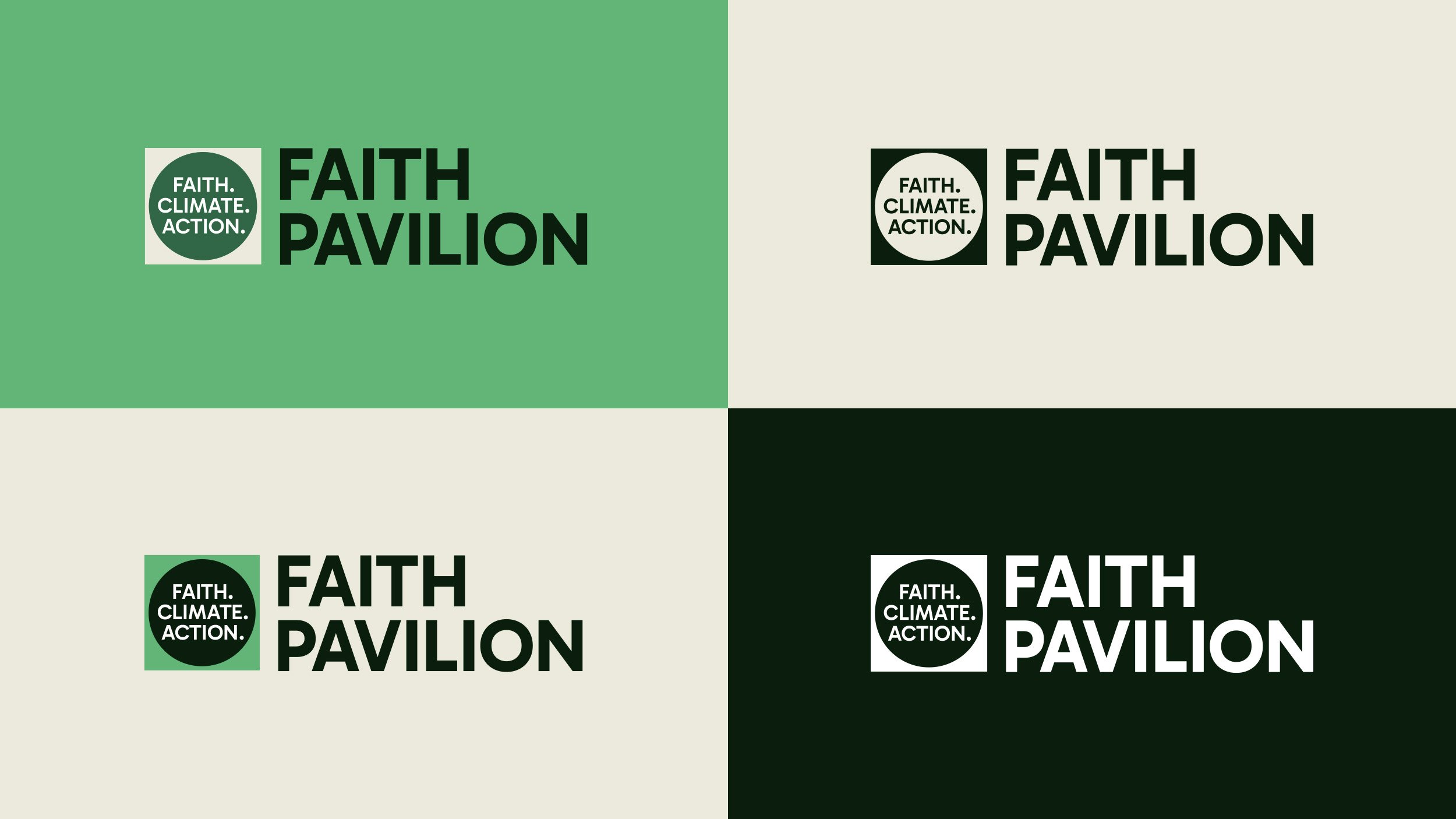
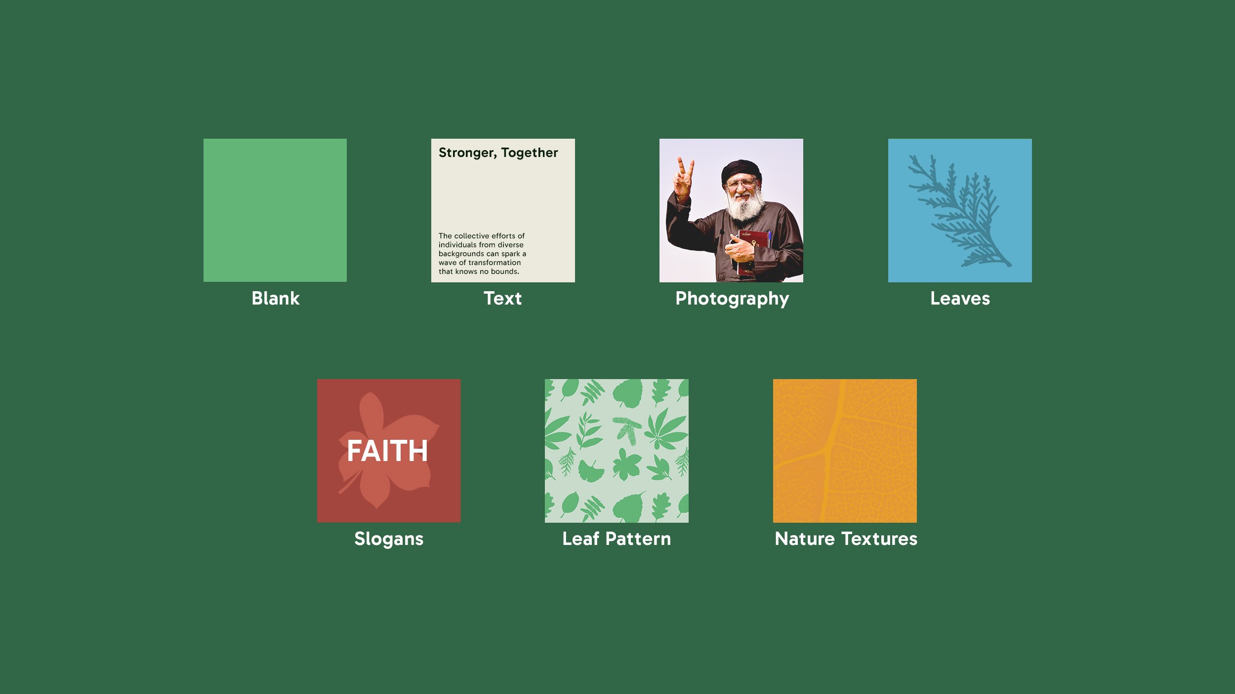
Overall the pavilion identity is built around a grid of squares, covering a range of content types, allowing for it to be scaled up or down to fit various scenarios. From social posts which might consist of a single 1:1 square to the pavilion’s exterior walls which might run for several meters utilising tens of squares, the grid is a simple method of ensuring versatility within a consistent framework. This was important as different partners and stakeholders will use the identity to create their own content and the Faith Pavilion brand design will exist in several different locations, physically and digitally.
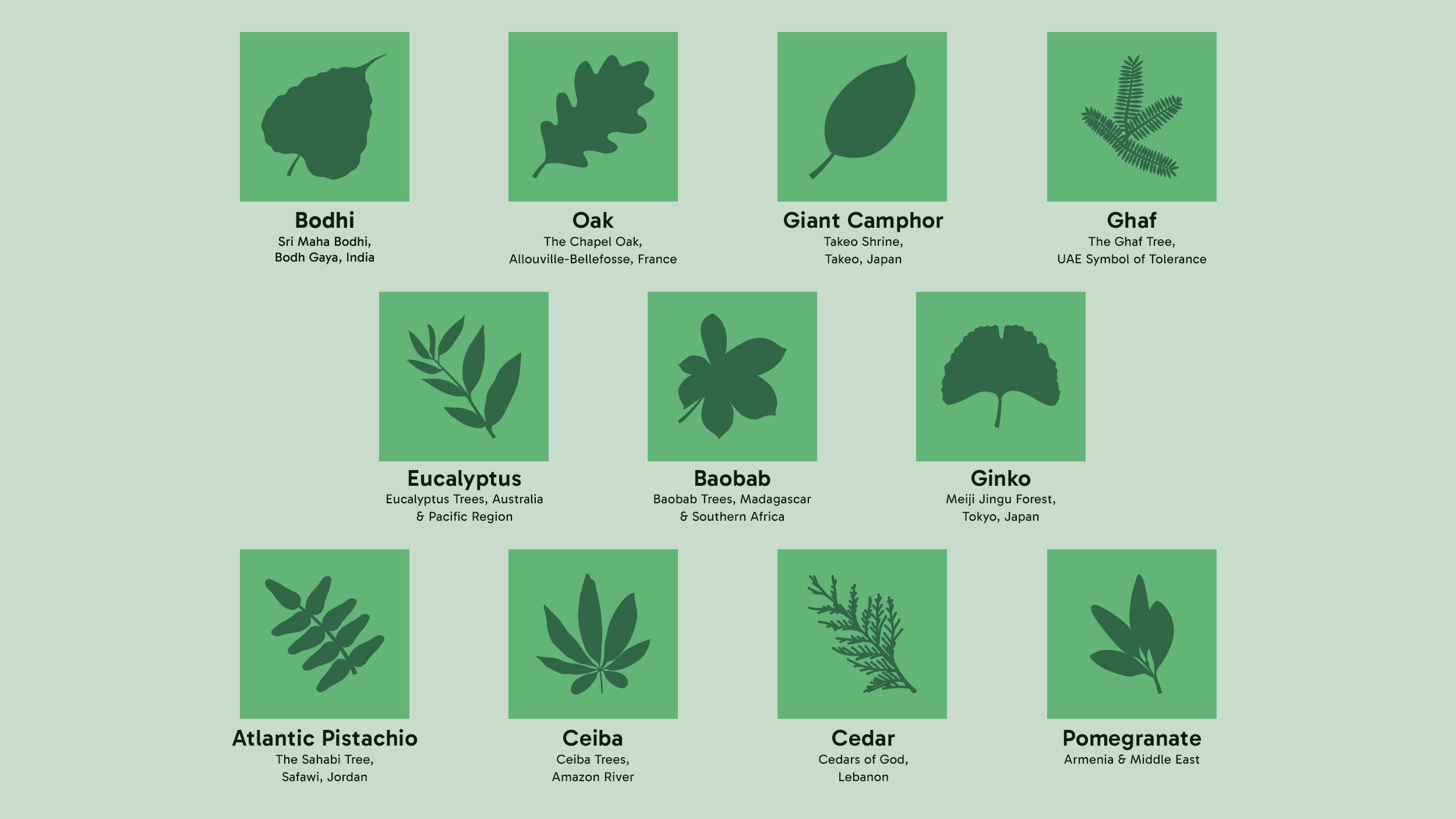
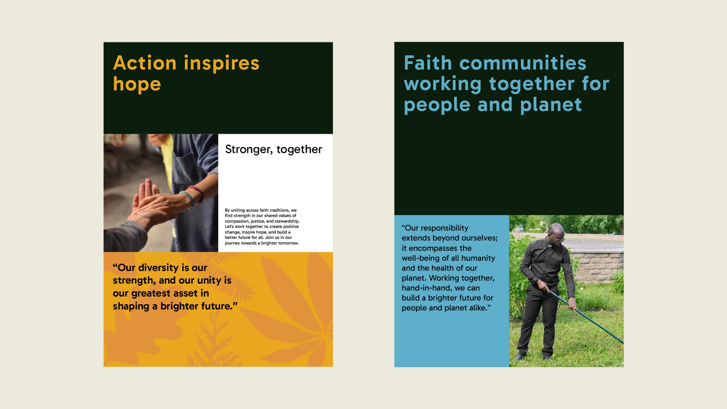
Inside the squares, there are several styles of content that can be used interchangeably across designs to create visual interest, aid messaging and provide different tones of voice. The colour palette was derived from nature for blank and text tiles and these were also used across as a set of textural backgrounds, used to add visual interest to designs and reinforce the ecological theme. This was also achieved through the use of leaf graphics, derived from eleven trees with religious or cultural significance from around the world, used as graphic devices and backdrops to text.
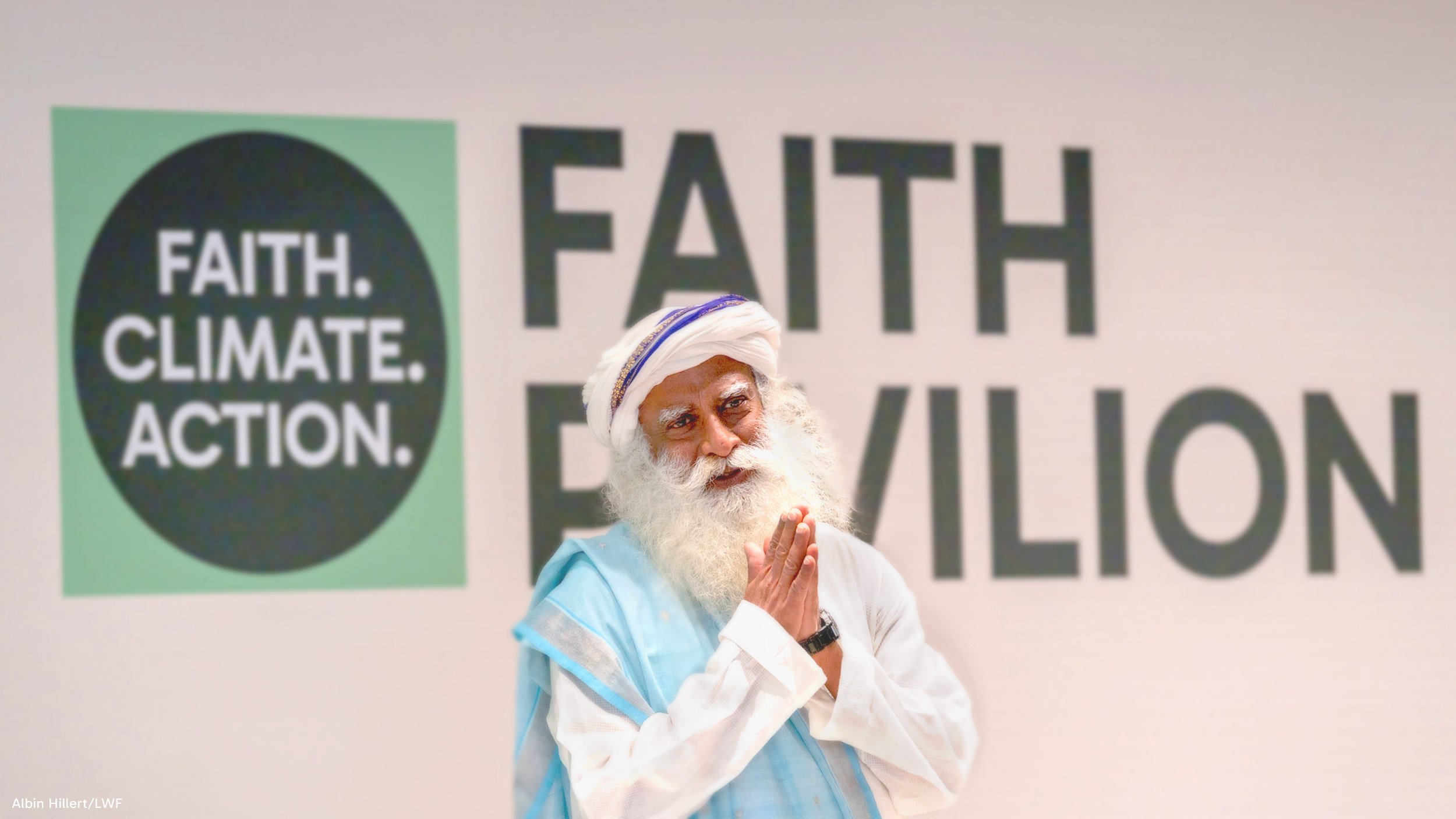
Photography was also integral to the visual identity, ensuring the pavilion was both lively and engaging; people respond to people, and faith communities are groups of people. Besides people of faith, faith leaders and also individuals less obviously of faith, it was important to show climate action taking place. Often climate imagery is dominated with images of protest and whilst this is valid, is not the only way individuals can work together towards climate goals – it was important to demonstrate various ways that Faith Communities are tackling climate change through their actions.
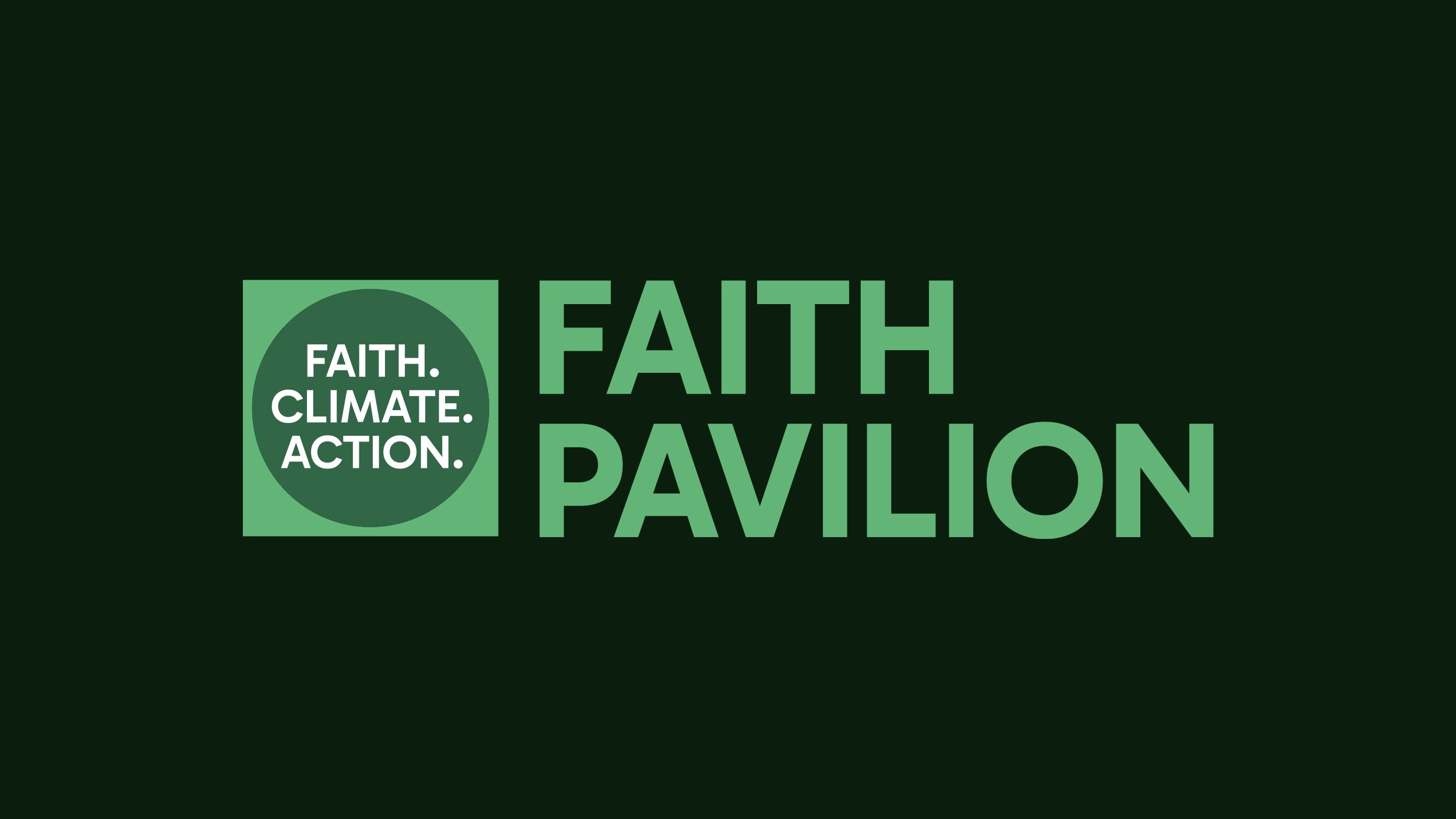
By comparison, the logo was relatively straightforward, prioritising clarity over anything else, though this also contained its own version of a square tile, utilising the pavilion’s slogan – Faith. Climate. Action. – as a reminder of its aims and intentions.